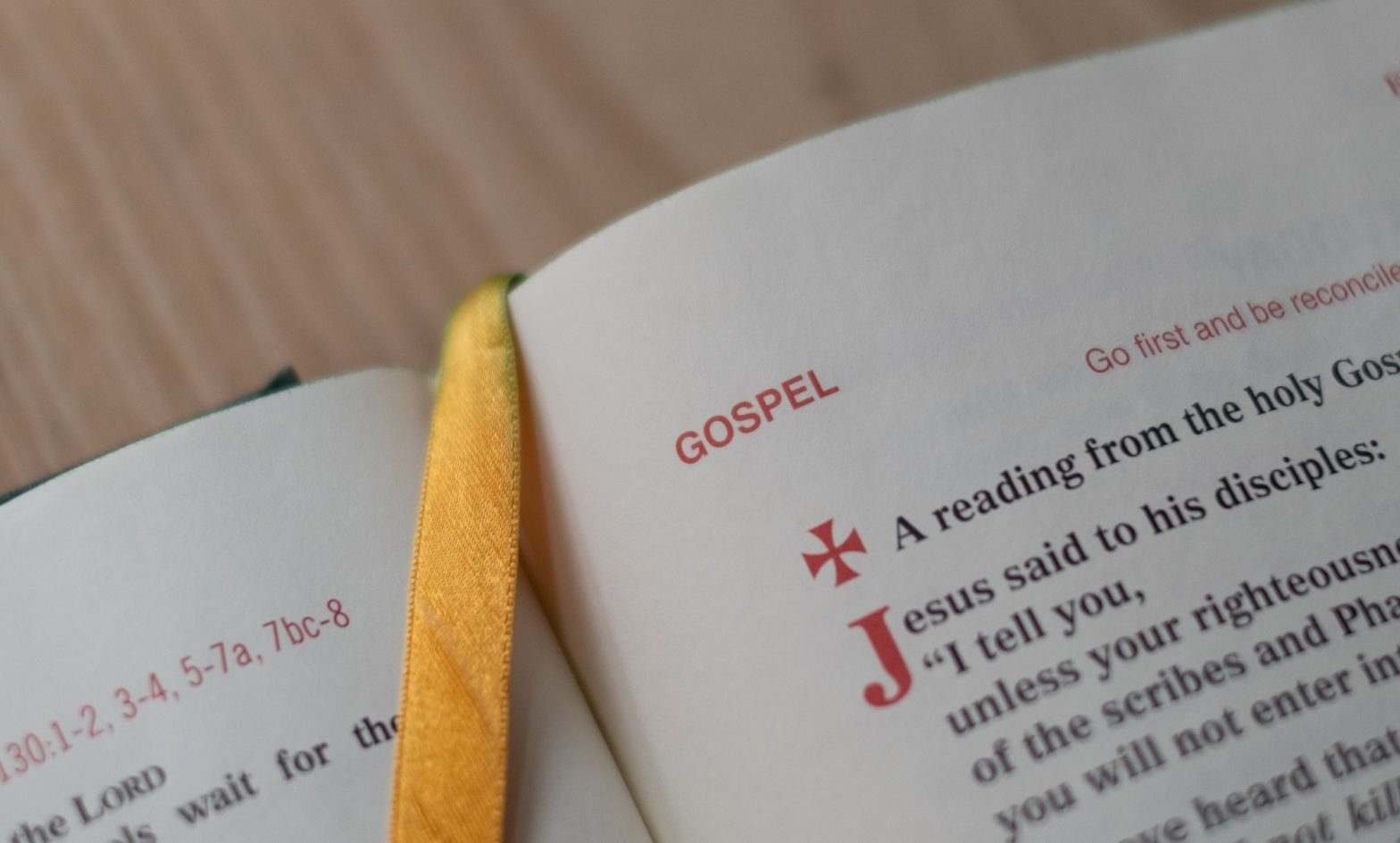
A Simple Guide to When You Need to Capitalize “Gospel(s)”

As SBL Press has explicitly recognized,

One of the more confusing issues that writers in New Testament studies face is when to write Gospel and when to use gospel instead.1

The key principles are

relatively straightforward until one begins actually writing; then questions inevitably arise.2

The SBL Handbook of Style directly addresses the capitalization of “gospel(s)” in two sections.3 And SBL Press has subsequently provided a supplementary blog post of nearly 1000 words.4

But even with all of this explanation, the issue might still be cloudy. So below, are the essential tests for when you need to capitalize “gospel(s).”

I’ve also ordered the tests in a sequence to help you avoid nonstandard capitalization. So as you work through the list from top to bottom, you can stop when you find the right category, lowercase or capitalize accordingly, and move on.

1. Always lowercase “gospels,” except in the phrase “Synoptic Gospels.”

The SBL Handbook of Style recommends capitalizing “gospels” when it refers to a canonical division.5 But SBL Press prefers “down style, that is, the use of fewer initial capital letters.”6 So, SBL Press now prefers you to lowercase “gospels.”7

This change means that the only time you should capitalize the plural “gospels” is in the phrase “Synoptic Gospels.” And here, note that “Synoptic” also gets capitalized, as does the shorter “Synoptics.”8

But if you have the singular “gospel” and not the plural, move to the next test.

2. Lowercase “gospel” if it refers to a proclamation.

Often, “gospel” doesn’t refer to literature at all. Instead, it means the good news about Jesus, the kerygma.

An example would be a sentence like “At the beginning of 1 Cor 15, Paul summarizes the gospel he preached.”

Because “gospel” here refers to a proclamation, a message, or a body of good news, it needs to appear in lowercase.

If your use of “gospel” doesn’t refer to a proclamation, however, keep working through the next test.

3. Lowercase “gospel” if it’s a “generic reference.”

One of the ways SBL style expresses its “down style” preference is that “gospel” also gets lowercased when used as a “generic reference.”9 But what qualifies as a “generic reference”?

SBL Press doesn’t seem to define this category explicitly. But it appears to describe a way of referencing a work that also identifies the genre of that work. (Thus, “generic” here includes the notion of “genre” rather than generality alone.)

If you’re unsure whether “gospel” is a generic reference, two tests can help you decide:

  1. Try replacing “gospel” with “work” to see if the sentence makes sense (e.g., “In his gospel, Matthew …”).
  2. Check whether “gospel” is functioning as an adjective to modify noun (e.g., “gospel narrative,” “gospel writers”).

If your use of “gospel” passes one of these two tests, you probably have a generic reference. So, you should lowercase “gospel.” But if neither of these tests works, move to the next test.

4. Capitalize “gospel” if it’s part of a title.

If you’re using “gospel” as part of the name for a title of a work, you need to capitalize it. SBL Press considers forms like the following to be titles:10

  • First Gospel
  • Matthew’s Gospel
  • Gospel of Matthew

The same convention would apply to other forms of titles for literary works (e.g., “Gospel according to Matthew”).

If you’re not using “gospel” in the context of a title, however, move to the next test.

5. Capitalize “gospel” if it’s a stand-in for a title.

If you’re using “gospel” alone as a stand-in for a title, you need to capitalize it.

It can be trickier to know when an instance of “gospel” counts as a stand-in for a title. But there’s still a test that can help.

If you’re unsure whether “gospel” is a stand-in for a title, replace that word or the phrase that includes it “gospel” with the full title of the gospel. If the replacement works, “gospel” is a stand-in for a title, and you need to capitalize it.

A great many uses of “gospel” by itself to reference a literary work actually fall into how SBL Press defines the “generic reference” category discussed above. By contrast, capitalizing “gospel” by itself as a stand-in for a title is pretty rare.

So you especially ensure your use of “gospel” isn’t a generic reference before you classify it as a stand-in for a title and capitalize it as such.

If your use of “gospel” doesn’t seem to fit this, or any of the other categories above, there aren’t any more tests to try to sort it out. But there is one clear action you can take to ensure your text correctly capitalizes (or lowercases) the term and communicates clearly.

6. Where needed, revise.

In some cases, you might not be satisfied with a sentence after you apply the capitalization that results from these tests. In that event, consider revising the sentence until you’re satisfied with the capitalization it involves.11

Conclusion

Deciding whether to capitalize “gospel” language can be tricky. But you can cut through confusion with the following five principles:

  1. Always lowercase “gospels,” except in the phrase “Synoptic Gospels.”
  2. Lowercase “gospel” if it refers to a proclamation.
  3. Lowercase “gospel” if it’s a “generic reference.”
  4. Capitalize “gospel” if it’s part of a title.
  5. Capitalize “gospel” if it’s a stand-in for a title.

And of course, if you aren’t satisfied with a sentence based on these principles, you can always revise it until you get it into the shape you want it.


  1. “Gospel versus Gospel,” weblog, SBL Handbook of Style, 15 November 2016, §1; italics original. Header image provided by Josh Applegate

  2. “Gospel versus Gospel,” §1; italics added. 

  3. Society of Biblical Literature, The SBL Handbook of Style, 2nd ed. (Atlanta: SBL, 2014), §§4.3.4.1, 4.3.6. 

  4. “Gospel versus Gospel.” 

  5. SBL Handbook of Style, §4.3.6. 

  6. “Gospel versus Gospel,” §2.2. 

  7. “Gospel versus Gospel,” §§1, 3.4. 

  8. “Gospel versus Gospel,” §§1, 3.1. 

  9. “Gospel versus Gospel,” §3.3. 

  10. “Gospel versus Gospel.” 

  11. “Gospel versus Gospel,” §§2.4–2.5, 3.5. 

How to Correctly Format Your Bibliography

The Student Supplement for The SBL Handbook of Style has some specific requirements for how your essay’s bibliography appears on the page.1

There are any number of common ways to fulfill these requirements that will also make that process harder than it has to be.

Fortunately, you’ve got some much better options for each step in creating a clean bibliography that has a proper

  1. Top margin,
  2. Heading,
  3. Heading spacing,
  4. First entry formatting,
  5. Subsequent entry formatting,
  6. First page pagination, and
  7. Subsequent page pagination.

Requirements 1, 6–7 (Top Margin, Page Numbering)

You can carefully set up your essay’s pagination. Then, at the end of your essay body, all you need is a new “Section Break (Next Page).” That one insertion will move you to a fresh page to start your bibliography. It will also allow your page numbers to continue in sequence and in the proper places. You can then manipulate the top margin just like for your essay’s first page.

Requirements 2–3 (Heading)

You can specify the bibliography heading alignment, capitalization, and spacing to the first entry within the style for first-level headings.

Requirements 4–5 (Entry Formatting)

You can edit Word’s default “Bibliography” style so that any text you apply it to will have a hanging indentation of 0.5 inches and a blank line following every paragraph formatted with that style.

To do so,2

  1. Go to the “Home” tab, and find the “Styles” section. You should see an arrow in the lower right corner of the section. Click this to expand the section into a panel.
  1. If it’s not currently in use, the “Bibliography” style might be hidden by default. To start editing the style, click the “Manage Styles” button at the bottom of the Styles panel.
  1. Sort the list of styles alphabetically. Find the style named “Bibliography.” Then, click “Modify ….”
  1. Double check that the “Bibliography” style is set to use the same font face and font size as you’re using in the rest of your document. If not, make the necessary adjustments. Then, click “Format” in the bottom-left corner of the “Modify Style” dialog box and choose “Paragraph ….”
  1. Under “Indentation,” find the dropdown box for “Special.” Choose “Hanging.” Word will then add 0.5 inches as the indentation distance, which happens to be what the Student Supplement requires. Under “Spacing,” select the number of points you want to add after each paragraph that will equate to one blank line. For example, if you’re using a 12-point font, you might add 12 points after the paragraph.3 Then press “OK.”
  1. After you’ve gotten the style formatting as you want it, decide whether you’ll want to use this same style formatting in other documents based on the same Word template.4 If so, choose the “New documents based on this template” option at the bottom of the “Modify Style” dialog box.
  2. Click “OK” to save the style formatting you’ve specified in the “Modify Style” dialog box. Click “OK,” “Cancel,” or the close button in the “Manage Styles” dialog box to return to your document.

Conclusion

Once you’ve edited the “Bibliography” style, you can move the formatting of bibliography paragraphs into the category of things you let Word do for you.

Combined with the other ways you can get Word to help you format a bibliography, this step will give you more consistent formatting with less work and fewer headaches.

And because of that, you can invest your time and attention not into bibliography formatting but into the people and projects that matter most.


Tired of fighting with Word? Want to be done with frustrated hours fussing over how to get the formatting you need?

My new guide shows you how to bypass all of this so you can let Word work for you while you focus on your research.

Garrett Thompson (PhD)

For students in any graduate program, mastering the full range of available research tools is crucial for efficient and consistent productivity. Dr. Stark has mastered these tools—the most important of which is Microsoft Word…. Students eager to take their work to the next level would do well to follow Dr. Stark’s in-depth guidance.


  1. Header image provided by Freestocks

  2. Here, I’m assuming you have a current version of Microsoft Word for Windows via Office 365. These instructions are based on v16.0.13127.20164. They should work on other recent versions as well. But you’ll notice greater differences in the process if you have an older version of Word. MacOS users may also notice some differences in these steps between the Windows and Mac versions of Word. 

  3. If you’re using a standard font like Arial or Times New Roman, the actual point value for one line is closer to 13.81. For SBL BibLit, it’s closer to 18.67. You can use these values if you’d like to be more precise, but probably no one will fault you for selecting the same number of points spacing as you have for your font size.  

  4. For an overview of some helpful ways to work with templates in Word, see my Microsoft Word: The Emerging Biblical Scholar’s Step-by-Step Guide for Windows and MacOS

How You Should Not Format Your Bibliographies

The Student Supplement for The SBL Handbook of Style has some specific requirements for your essay’s bibliography.1

You can get the words on the page in your bibliography to look like the Student Supplement requires in a few different ways.

Unfortunately, some common approaches to formatting your bibliography have undesirable side effects.

What the Student Supplement Requires

Before I get into that, though, it’s helpful to review what the Student Supplement requires.

In sum, from the beginning of the bibliography, this is,

  1. A new page with a two-inch top margin.
  2. The word “BIBLIOGRAPHY” center-aligned and uppercased.
  3. Two blank lines.
  4. Your first bibliography entry, single-spaced with a hanging indentation of 0.5 inches.2
  5. If you have more than one bibliography entry, you’ll add a blank line. Then, you’ll add your next entry, also single-spaced with a hanging indentation of 0.5 inches. And you’ll continue repeating this format until you’ve included all the bibliography entries you need.
  6. On the bibliography’s first page, you’ll have a page number consecutive with the rest of the essay and centered in the bottom margin.
  7. If you have more than one page to your bibliography, you’ll then have a page number right-justified in the top margin.3

How Not to Format Your Bibliography

For several of these features of the bibliography, there’s a pretty obvious way to get the text on the page to display like you need.

Unfortunately, these sometimes more obvious methods also have significant downsides. In particular, they can lead to a mess at the end of your essay.

So, they’ll end up costing you additional time, effort, and attention to manipulate the formatting of your bibliography.

For example, you might

  • Press “Enter” repeatedly to get from the last line of your essay body to a new page. Then you might press “Enter” about four more times to get what looks like roughly a two-inch top margin. But then, if your essay body lengthens or shortens as you edit, you need to re-manipulate this spacing.
  • Press “Enter” twice to get roughly two blank lines between the title “BIBLIOGRAPHY” and your first entry. But you’ll need then to remember or recheck the Student Supplement to confirm that that spacing is correct.
  • Type out the first line of your first bibliography entry. Then you might press enter and tab over to type a second (or third) line for that same entry that looks like it’s spaced in from the left margin. Or you might format that second (or third) line with a first-line indent like most new paragraphs. In either of these cases, if you have to edit the bibliography entry, you might change where the lines need to wrap. And you’ll have to manually manipulate the formatting to produce the correct indentation. Or if your margin size changes from one project to another (e.g., from an essay with 1-inch margins to a dissertation with a 1.5-inch left-hand margin), copying and pasting the same bibliography entry will also mean that you need to manually adjust where the line breaks fall.
  • Press “Enter” to create a blank line between each bibliography entry. But if you do this, the blank line might actually appear at the top of a page and so look like an enlarged top margin. In that case, you’d need to manually manipulate the spacing to insert or take out a blank line as appropriate.

Conclusion

In all of these scenarios, you have two choices. You can have an essay with a poorly formatted bibliography. Or you can spend unnecessary time and attention proofing and massaging your bibliography’s formatting to ensure you get things just right.

Obviously, neither of these alternatives is that good. You want a clean bibliography. And you want to spend your time and attention actually improving your essay’s content—not just manipulating its jots and tittles.

Fortunately, you’ve got some much better options for each step in creating a clean bibliography.


Tired of fighting with Word? Want to be done with frustrated hours fussing over how to get the formatting you need?

My new guide shows you how to bypass all of this so you can let Word work for you while you focus on your research.

Garrett Thompson (PhD)

For students in any graduate program, mastering the full range of available research tools is crucial for efficient and consistent productivity. Dr. Stark has mastered these tools—the most important of which is Microsoft Word…. Students eager to take their work to the next level would do well to follow Dr. Stark’s in-depth guidance.


  1. Header image provided by Freestocks

  2. A “first-line” indentation is the kind of indentation you might be most used to seeing at the beginning of a new paragraph. The first line is indented from the left margin by a certain amount (e.g., 0.5 inches). The remaining lines in that paragraph then start flush with the left margin. A “hanging indentation” is just the opposite. The first line starts flush with the left margin. All subsequent lines are indented from that margin by a certain amount (e.g., 0.5 inches). 

  3. Melanie Greer Nogalski et al., Student Supplement for The SBL Handbook of Style, Second Edition, ed. Joel M. LeMon and Brennan W. Breed, rev. ed. (Atlanta: SBL, 2015), §§2.3, 2.11, 3.5. 

How to Easily Change First Page Margins in Word

If you’re writing the degree program you’re in, SBL style normally requires four 1-inch page margins.1

There are two common kinds of exceptions to this:2

  1. Your title page, which should have 1-inch side margins but 2-inch top and bottom margins.
  2. The first page of a major section (e.g., your essay body, a chapter, an appendix, your bibliography), which should have a 2-inch top margin.

For title pages, using section breaks to achieve the necessary margin sizes is useful. But this usefulness partly depends there being a hard division in content between your title page and what comes next.

Your title page is only ever going to be one page. You’re never going to make edits to your title page and want text to flow over from there onto the next page.

When (Not) to Use Section Breaks to Change Essay Margins

The same isn’t true in the body of the other major logical sections of your document.

For these, you may very well want to make a change on the first page. That change might need to change where the division falls between that page and the one following.

In this context, using section breaks to manipulate the top margin may have undesirable side effects.

Not least among these is potentially having to manipulate the section break or the text around it multiple times in order to get the margins to work like you’re wanting.

There is, though, a much easier way to change the top margin here without creating a new section.

An Easier Way to Change First Page Margins

And that easier way is simply not to change the top margin at all.

That might sound counter intuitive. But you’re really only after the visual representation of a 2-inch top margin at the beginning of a logical section.

Word and similar applications put different things at the top of the page (e.g., margin, header, gutter). But what the software calls what it puts there isn’t something SBL style concerns itself with.

With that in mind, there emerges another much easier way of getting the page layout specified in the Student Supplement. And it doesn’t actually require you to manipulate what Word calls the top “margin” for the first page.

Instead, you’re already familiar with how Word lets you choose your font size in a unit called “points.” And aside from some other complexities that don’t matter for this discussion of margin size, 72 type points are equal to 1 inch.

You already have the other 1 inch down from the top of the page inside what Word calls its “margin” proper.

So, all you need is 1 more inch. And to create the visual effect of this inch, you can simply add 72 points of space before the first element on that page (e.g., paragraph, heading).3

You can add these 72 points via the paragraph formatting dialog box as shown below.

You can add this formatting to individual paragraphs. Or if you distinctively start new logical sections with the same element (e.g., a first-level heading), you can specify this additional spacing via that element’s style.

Conclusion

So when you’re setting the top margin of a main logical section in your document, you do need to change the visual margin.

But that doesn’t mean you need to go through the mess of using the margin function in Word to get the job done.

What you’re essentially looking for is the visual result on the page. And it’s much easier to get that result by simply adding whitespace before the first element on that page.


Tired of fighting with Word? Want to be done with frustrated hours fussing over how to get the formatting you need?

My new guide shows you how to bypass all of this so you can let Word work for you while you focus on your research.

Garrett Thompson (PhD)

For students in any graduate program, mastering the full range of available research tools is crucial for efficient and consistent productivity. Dr. Stark has mastered these tools—the most important of which is Microsoft Word…. Students eager to take their work to the next level would do well to follow Dr. Stark’s in-depth guidance.


  1. Melanie Greer Nogalski et al., Student Supplement for The SBL Handbook of Style, Second Edition, ed. Joel M. LeMon and Brennan W. Breed, rev. ed. (Atlanta: SBL, 2015), §§2.1, 2.8. Header image provided by Etienne Girardet

  2. Nogalski et al., Student Supplement, §§2.11, 3.3–3.5. The table of contents for a longer document is, however, an exception to this rule and should have a 1-inch top margin. Nogalski et al., Student Supplement, §3.2. 

  3. You can come close to creating this additional first-page spacing by entering blank paragraphs at the top of the page. But doing so makes that spacing subject to some of the peculiarities of font and line sizing that you don’t have to worry about otherwise. 

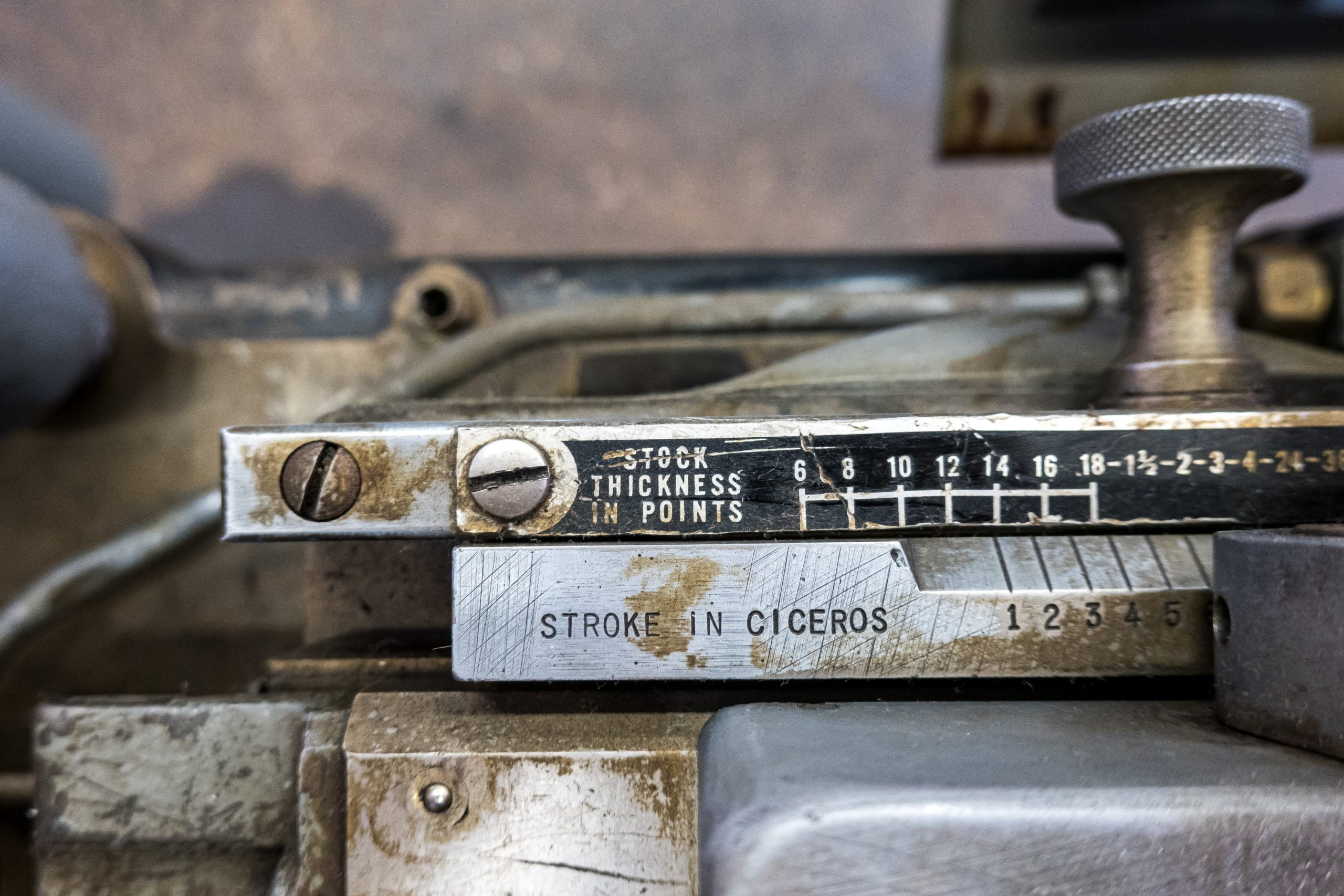
The Odd Thing about Font and Line Sizes

When you select a font in Word, you select its size in a unit called “points.”1

But just like the font size, the font face also affects the visual size of lines and type on the page.

So if you need to space content precisely on a page, you need to recognize that font points aren’t type points.

Font Points Aren’t Type Points

In theory, one point is equal to 1/72 of an inch. (For clarity from here, I’ll call this a “type point.”)

But, by comparison with 12-point Times New Roman text,

  • Twelve-point Arial text occupies noticeably more horizontal space.
  • Twelve-point SBL BibLit text occupies noticeably more vertical space.

So not all fonts are created equal in terms of what a “point” means for a single-spaced line in that particular font.2 (I’ll call this a “font point” since it’s tied to the font size you actually set in Word.)

Font Points and Type Points on a Title Page

A Title Page as an Example

If you use the Student Supplement for The SBL Handbook of Style or something similar, Word can handle title pages quite well.3

So, you can (and should) hand off your title pages to Word so that it can take the formatting and layout minutiae off your plate.

You’ll get a better end product, and you’ll be able to spend time on the content of your research that you would otherwise have devoted to manipulating the layout of your document.

That said, I want to use a title page to illustrate how font and type points do (and don’t) work. And in particular, I’ll assume the title page framework given in the Student Supplement.

Points and Line Spacing

In this framework, if you allow a 2-inch top and bottom margin on 11-inch high paper, that allows you 7 vertical inches on the page in which to distribute content (= 11 inches total – 2 inches for the top margin – 2 inches for the bottom margin).

Line Spacing = “Exactly 12 Points”

If your text is “12-point,” Times New Roman, and spaced at exactly 12 points, you can fit 42 lines of text vertically down these 7 inches, or 504 type points because

  • 504 type points = 7 inches × 72 type points per inch and
  • 42 lines = 504 type points ÷ 12 type points per line.

Line Spacing = “Single Spaced”

But if your text is “12-point,” Times New Roman, and single spaced, you’ll be able to fit vertically down these same 7 inches only about 36.5 lines of text.

This means that, if you use “12-point” Times New Roman font, one “single spaced” line will actually occupy about 13.81 type points of vertical space on your page(= [72 type points per inch × 7 inches] ÷ 36.5 lines).4

Arial appears to take up the same amount. SBL BibLit, by contrast, occupies closer to 18.67 type points vertically on the page when you select a “12-point” font size in Word.

That means one single spaced line of SBL BibLit font occupies slightly more than ⅓ more vertical space on the page than one single-spaced line of Times New Roman or Arial.

Line Spacing down a Full Page

Down a full title page, there will be at least 8 lines of type:

  • Institution block: 1 line
  • Title block: 1 or more lines
  • Class block: 3 lines
  • Author block: 3 lines

So, if you use “12-point” Times New Roman font, you might think these 8 lines would occupy 96 type points vertically on the page (= 8 lines × 12 font-type points per line).

But they won’t. They’ll actually occupy 110.48 type points (= 8 lines × 13.81 type points per line).

Over the page as a whole, the total difference of 14.48 type points (= 110.48 type points – 96 type points) equates to about two tenths of an inch (= 14.48 type points difference ÷ 72 type points per inch). That assumes you’re using Times New Roman or Arial.

If you use SBL BibLit, the difference is greater. Eight lines of single-spaced type will be about 149.36 type points (= 8 lines × 18.67 type points per line).

That’s just shy of three quarters of an inch longer on the page than if the lines were spaced at exactly 12 type points (= [149.36 type points – 96 type points] ÷ 72 type points per inch).

Conclusion

Whenever you need a precise page layout, first see whether Word will handle the details automatically. It probably will.

But if not, understanding the difference between font and type points should help you achieve that layout much more easily.


Tired of fighting with Word? Want to be done with frustrated hours fussing over how to get the formatting you need?

My new guide shows you how to bypass all of this so you can let Word work for you while you focus on your research.

Garrett Thompson (PhD)

For students in any graduate program, mastering the full range of available research tools is crucial for efficient and consistent productivity. Dr. Stark has mastered these tools—the most important of which is Microsoft Word…. Students eager to take their work to the next level would do well to follow Dr. Stark’s in-depth guidance.


  1. Header image provided by Etienne Girardet

  2. For some introductions to why this is, see “Leading,” weblog, The Four-Eyed Raven, n.d.; Matt Samberg, “Line Spacing, Explained,” weblog, Medium, 15 September 2015. 

  3. Melanie Greer Nogalski et al., Student Supplement for The SBL Handbook of Style, Second Edition, ed. Joel M. LeMon and Brennan W. Breed, rev. ed. (Atlanta: SBL, 2015). 

  4. Leading.” Based on my own measurements, this seems to be slightly more accurate than the round 14 points reported by Samberg, “Line Spacing, Explained.” But Samberg’s essay still has a great deal of valuable information. 

How to Justify Your Title Page Text Blocks in No Time

When you’re working on a title page, it’s best to delegate its formatting to Word as much as possible.1

Doing so will save you time spent formatting. It can also give you a title page that’s more precisely formatted.

Before you distribute the text blocks vertically on your title page, you should be sure to segment your title page’s text blocks appropriately.2

You may also want to go ahead and format your title page text. That way, once you distribute the text on your title page, it’ll be ready to go.

Vertically Justify Your Title Page Text

Once you’ve got your title page text ready, highlight the contents of your title page—but not the section break that separates your title page from the next section of your document.

(Just for context, if you lay out your document like I recommend, that section break will go to your table of contents for long essays and your essay body for short essays.)

Then, from the “Layout” tab, choose “Margins” and “Custom Margins….”

On the “Margins” tab, set both the top and the bottom margins to 2 inches.

Then, click on the “Layout” tab. Under the “Page” section on this tab, change “Vertical alignment:” to “Justified,” and click “OK.”

When you complete this last step after you’ve properly formatted and segmented your title page text, you should then see your title page content

  • In all capital letters,
  • Centered on the page left-to-right, and
  • Distributed vertically on the page so that you have (a) 2-inch top and bottom margins and (b) even spaces between each text block on the title page that are as close as possible to 2 inches.

Double Space Your Title If It’s Multiple Lines

If your title happens to be more than one line long, the Student Supplement for The SBL Handbook of Style wants your title to be double spaced.3

So, before you move on from your title page, it’s a good time to double check whether you need to adjust the line spacing for your title.

If you do, you can change the line spacing directly from the “Home” tab. Simply highlight your title block (block 2), and change the line spacing to “2.0.”

Conclusion

With these simple steps, you can largely delegate your title page formatting to Word.

By letting Word handle the minutiae of your title page’s text and layout, you can avoid time and effort spent manipulating this formatting yourself.

And that’s time you’ve regained to invest into the content of your research and writing.


Tired of fighting with Word? Want to be done with frustrated hours fussing over how to get the formatting you need?

My new guide shows you how to bypass all of this so you can let Word work for you while you focus on your research.

Garrett Thompson (PhD)

For students in any graduate program, mastering the full range of available research tools is crucial for efficient and consistent productivity. Dr. Stark has mastered these tools—the most important of which is Microsoft Word…. Students eager to take their work to the next level would do well to follow Dr. Stark’s in-depth guidance.


  1. Header image provided by Etienne Girardet

  2. In these comments, I’m assuming you’re trying to format your title page as specified in Melanie Greer Nogalski et al., Student Supplement for The SBL Handbook of Style, Second Edition, ed. Joel M. LeMon and Brennan W. Breed, rev. ed. (Atlanta: SBL, 2015), §§2.8, 3.1. For an overview of the four title page blocks that the Student Supplement requires, see “The Fundamentals of How to Format a Title Page.” In the steps illustrated here, I’m assuming you’re using the most current version of Word available via an Office 365 subscription. As of this writing, that’s 16.0.12624.20278. Any reasonably recent version of Word should work similarly. But increasingly older versions may have increasingly larger differences in how they match the steps I describe here. 

  3. Nogalski et al., Student Supplement, §3.1.